

Result
To create a distinct identity for their anniversary, we proposed an update to their logo and a set of accompanying materials to tell the world about what they had achieved.
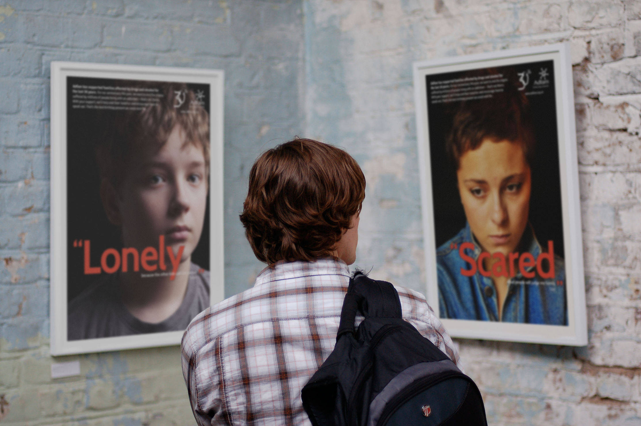
The special ‘mark’ is composed of a birthday ribbon, reflecting the playfulness and energy of the core branding, but catching the eye of people that may be accustomed to the corporate logo already. The colour palette is intended to be both bright and reflect the severity of the charity’s mission. This device extends across promotional materials, and exhibition design, which also features photography of those supported by them in the past 30 years.


Impact
The charity received signifiant press thanks to their social media fundraising Campaign around the 30th anniversary, including in Third Sector and Campaign magazines. The increased visibility led them to be able to expand their research and policy bids with a number of different public and private bodies.

“Our anniversary was a huge event in our history and It's Like This' work helped make it a real success. The resources they designed were used in our high-profile series of photo exhibitions around the country. We are in much stronger position now.”