Result
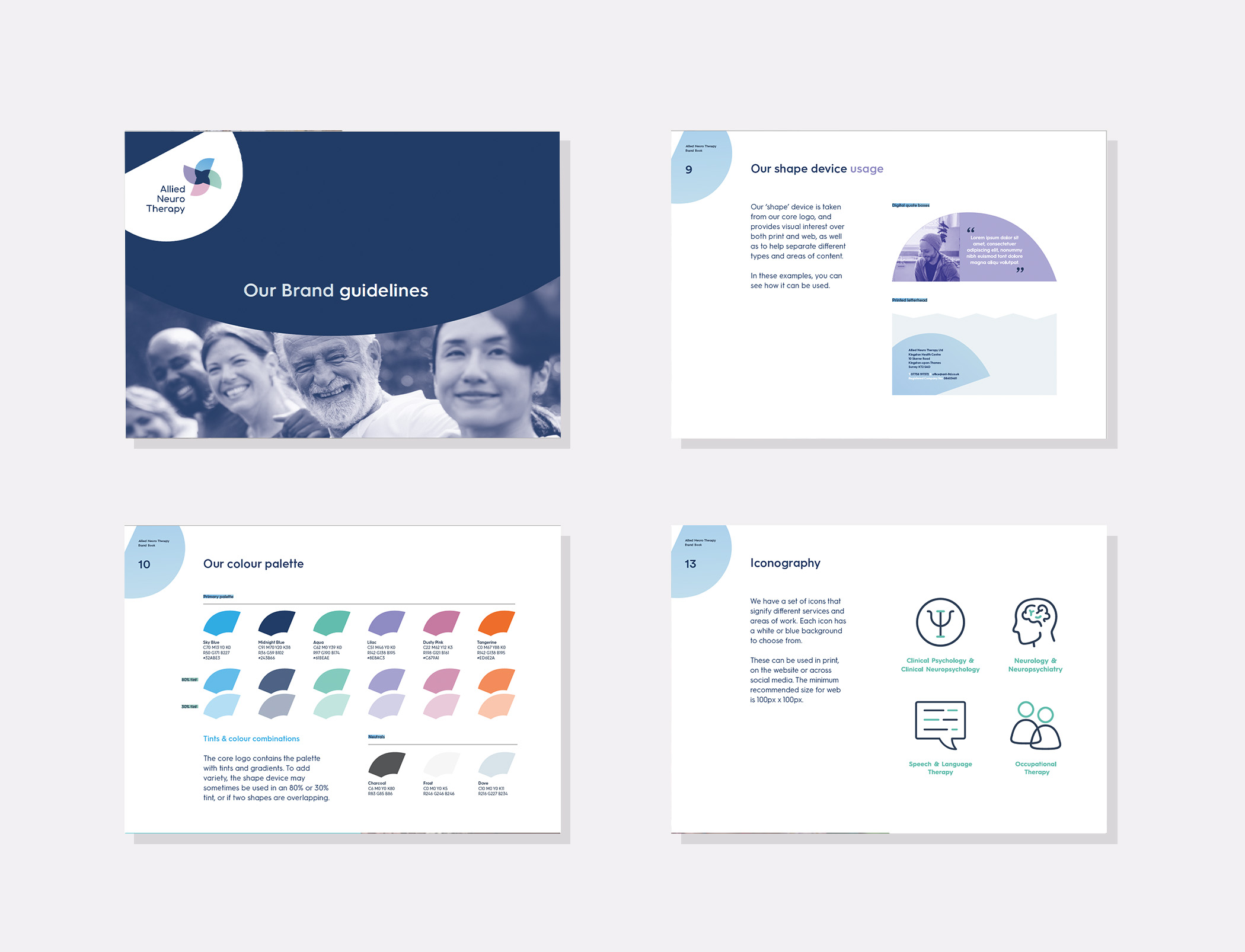
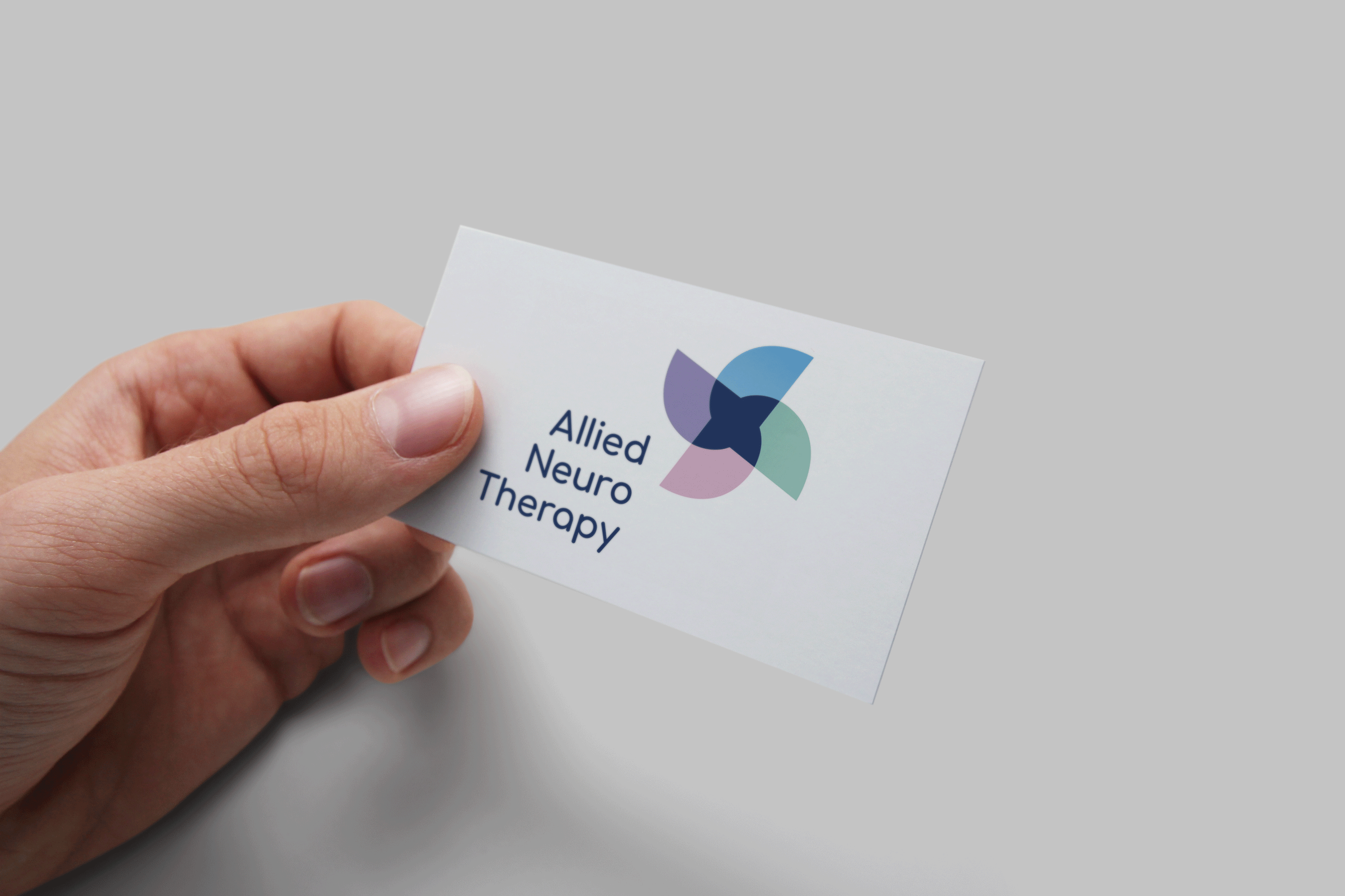
We created a visual identity to imply movement and transition, an analogy for recovery. This idea carried through to how the form was animated as a logo or ident online, as well as the movement implied in print through the collection of shapes and colours chosen. Whilst it could be associated with the sector and services, it also offered a fresher, lighter touch.
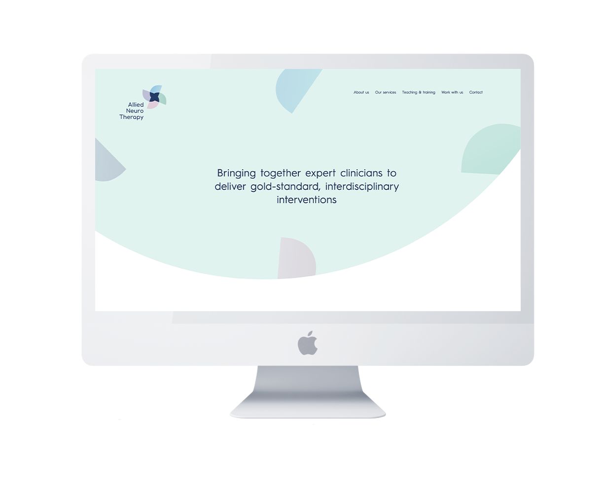
Affirming the outcomes from our research phase every step of the way, we built their website and digital templates to reinforce this visual analogy and provide a mandate for engagement for their prospective clients, allowing for architecture that would easy enable a possible Phase 2, expanding their offer to member and patient-only areas.
In addition, we created bespoke learning modules to help their wider network of staff use the templates and website we created – ensuring the brand was as coherent and powerful as possible, and fulfilling a crucial design facet for us, allowing people to feel empowered and to self-serve.

“Producing our new brand was a real step-change in how we talk about and present our service. It's Like This were fantastic at getting a tough job done in a time-pressured schedule, especially working with multiple clinicians who are often difficult to get hold of for non-patient work. The coherence and clarity which we have achieved through their careful enquiry and process really impressed us.”